
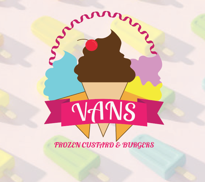
The famous Van’s Frozen Custard and Burgers in West Dundee, IL is a very popular food joint that many ages go to for the amazing ice cream and food. When looking at the color scheme of red and yellow I knew something had to change with the logo to make it more inviting, more appealing and more attractive to describe them which is 90% ice cream. The company was established in 2007, and has been around since 2012; owned by Chad Van Acker. They have high end quality food and pride so why not give them a revision of a high end logo with some fun & inviting colors.
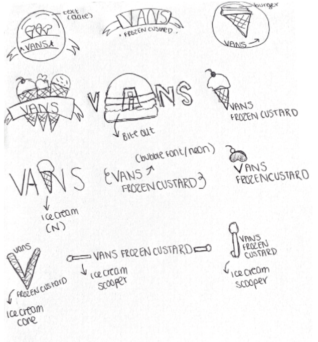
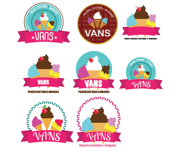
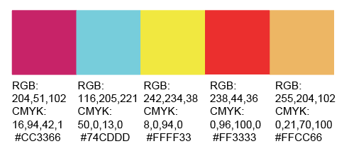
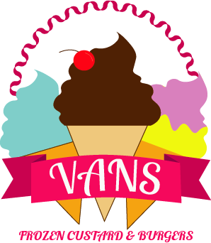
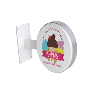
Using fun, flavorful colors of pink and blue. I ended up making a vintage, emblem for Van’s while still using the elements of ice cream and full lettering. I wanted to spark interest into the dessert by making it eye appealing to all ages versus the plain yellow and red the original logo had that made it feel less appealing and less inviting. The logo is very colorful, very inspiring and really draws the viewer in to want ice cream using various flavors to represent the brand.
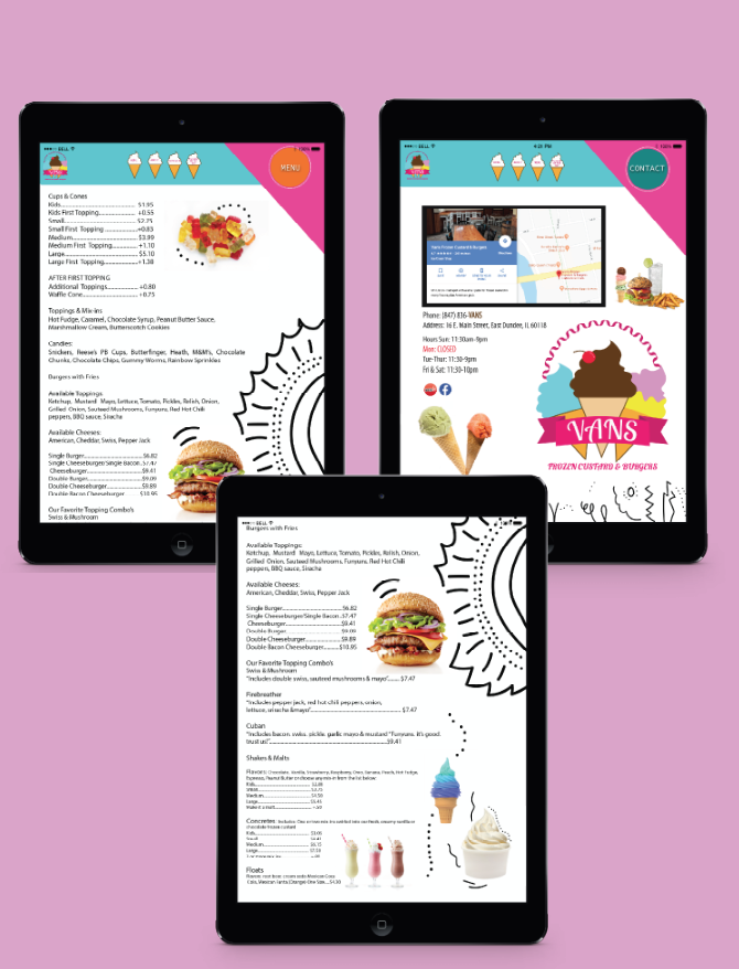
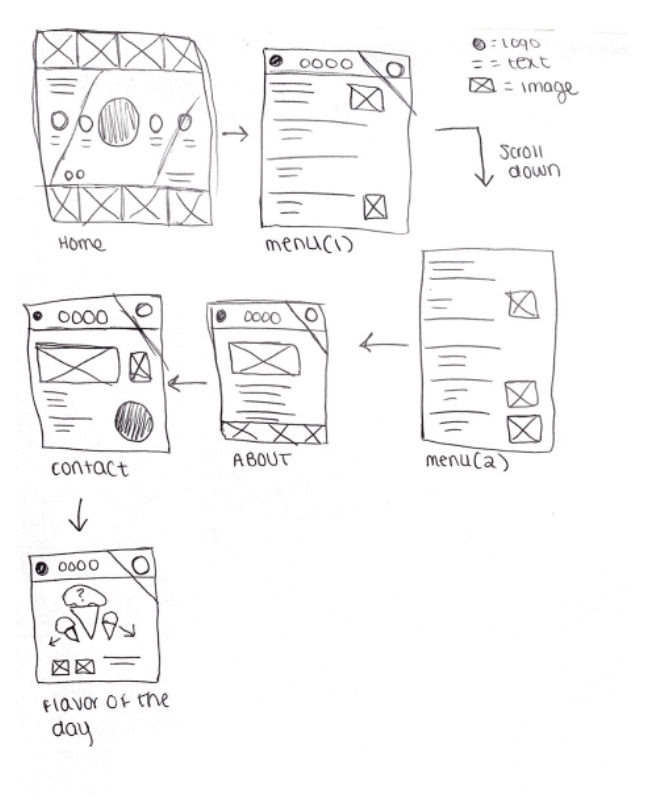
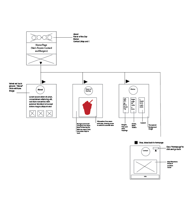
When re-evaluating the material needed for Van’s, I wanted to make a unique way for viewers and consumer’s to spend time researching and looking into the restaurant. Making the overall website very user friendly, easy, and straight to the point, the site allows users to look deeper into the menu, contact the resurant and have the ease to pull up the mobile friendly site within their phone. The idea was to make it child friendly just as Van’s original goal was. And to attract older, and teenage audiences in for the ideal icecream shop. By removing the red and yellow this allows for Van’s to feel brighter and more exciting to look at and feel.


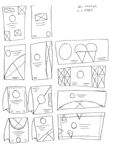
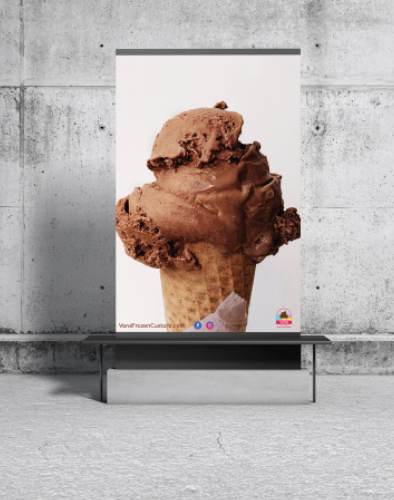
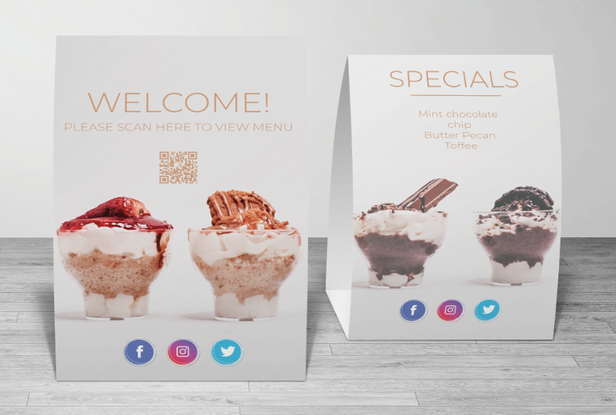
When looking upon different advertisements companies have done with ice cream, I wanted to make it very appealing and tasteful. I wanted the product to scream before the company allowing the audience to take several looks. The goal was to make a table tent that you could scan off of leadning you to the physcial app made above. It reduces the amount of paper and ease for many users to decide what they want digitally. The goal was to keep the theme very opaque and chocolate theme while having the logo bright and playful.
